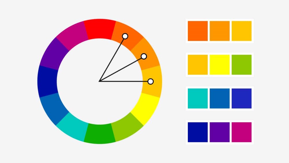
Analogous Color
Analogous colors are a group of related colors. They sit next to each other on the color wheel. This color scheme creates a strong sense of harmony and unity. For example, red, red-orange, and orange are analogous colors. Their close relationship makes them visually pleasing. They blend together smoothly and are easy on the eye. This effect is the opposite of a high-contrast complementary color scheme.
Understanding the Color Wheel Relationship
An analogous color scheme is simple to identify. You start by picking one dominant color on the color wheel. Then, you select the colors on either side of it. This group typically includes three to five colors. For instance, a common analogous scheme could be yellow, yellow-green, and green. In this case, yellow or green might be the dominant color. The other colors serve as accents and supporting tones. This close grouping creates a very low-contrast palette.
The Psychological Impact of Harmony
Filmmakers use analogous colors to create a specific mood. This palette often feels serene, calm, and peaceful. It can make a scene feel comfortable and natural. Audiences often associate these schemes with the real world. For example, a sunset displays a beautiful analogous range. It moves from red to orange to yellow. A forest is also analogous, with its many shades of green and yellow-green. This harmony guides the viewer’s eye gently through the frame. It does not create the jarring tension of high-contrast colors.
Analogous vs. Complementary Schemes
Understanding analogous colors is easier when you compare them to complementary colors.
- Analogous colors are neighbors on the color wheel. They create unity and harmony.
- Complementary colors are opposites on the color wheel (like red and green). They create high contrast, tension, and visual excitement.
A filmmaker might use a complementary scheme. This would make a character in a red coat “pop” against a green background. Conversely, a filmmaker uses an analogous scheme to make the entire frame feel cohesive. A character in a red coat might stand against an orange wall. This choice directly impacts the story’s emotional tone.
Practical Use in Filmmaking
Filmmakers can create analogous palettes in three main ways.
- Production Design: The art department can choose props, sets, and wardrobe. These items would all fall within a specific color family. For example, a character’s apartment might be decorated in blues, blue-greens, and purples.
- Cinematography: A cinematographer can use colored gels on their lights. They might add a warm gel to the key light and a slightly different warm gel to the fill light. This tints the entire scene in an analogous range.
- Color Grading: In post-production, a colorist can “push” the colors. They can tint the shadows toward blue and the midtones toward teal. This creates a modern, analogous look.
Many films use this technique effectively. The Coen Brothers famously used an analogous “sepia” look in O Brother, Where Art Thou?. This desaturated palette of yellows, greens, and browns unified the entire film. These choices are deliberate. They build a specific, stylized world for the story.
« Back to Glossary Index